WAVE

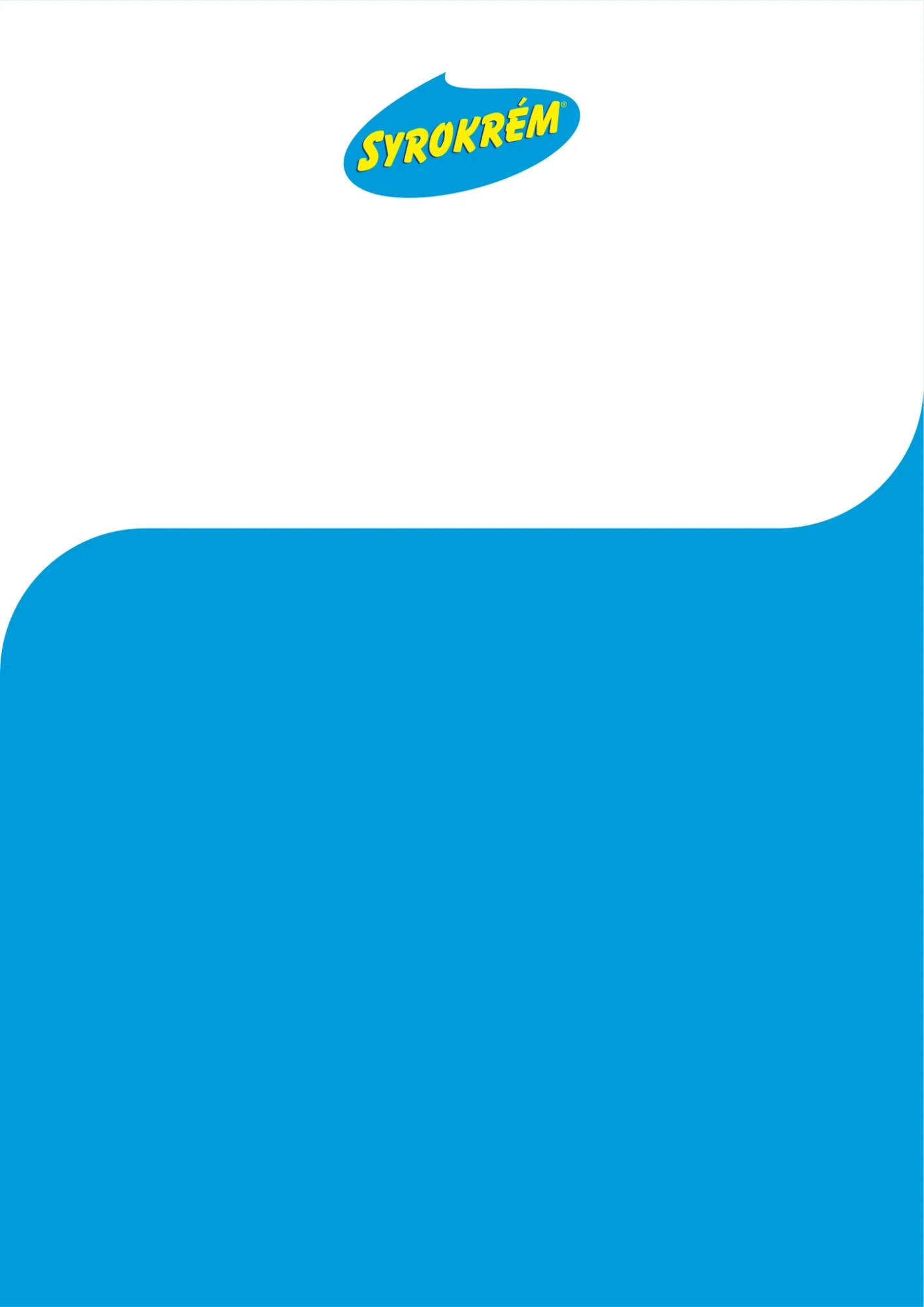
A wave of freshness is a fundamental building block of print and online visuals.
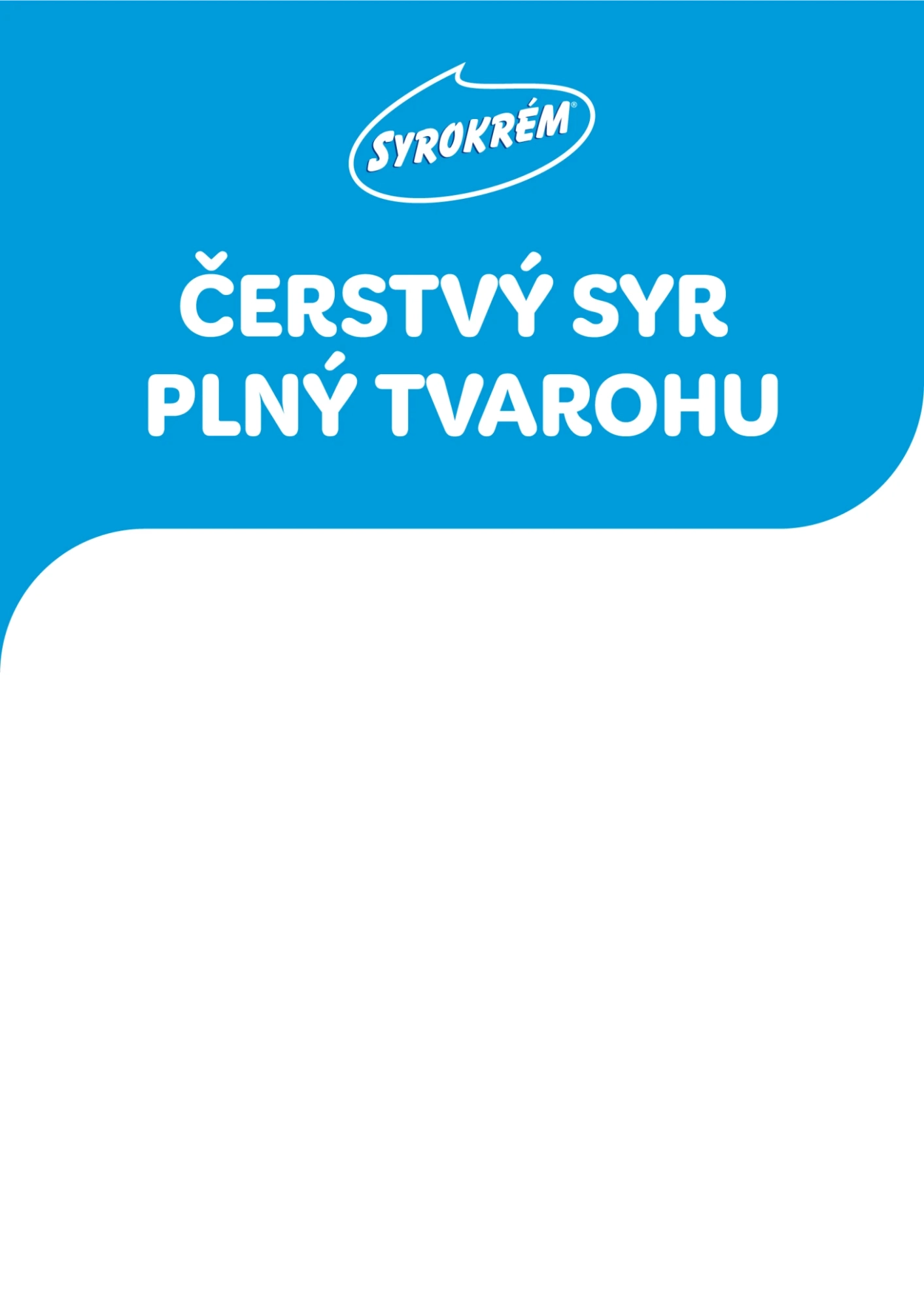
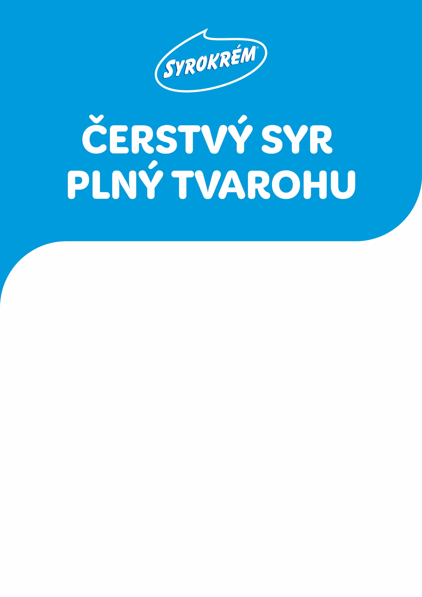
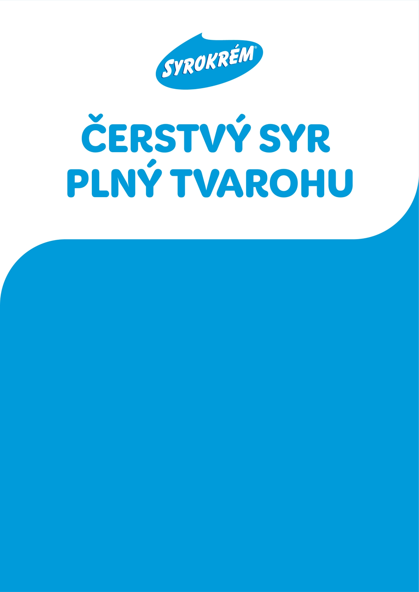
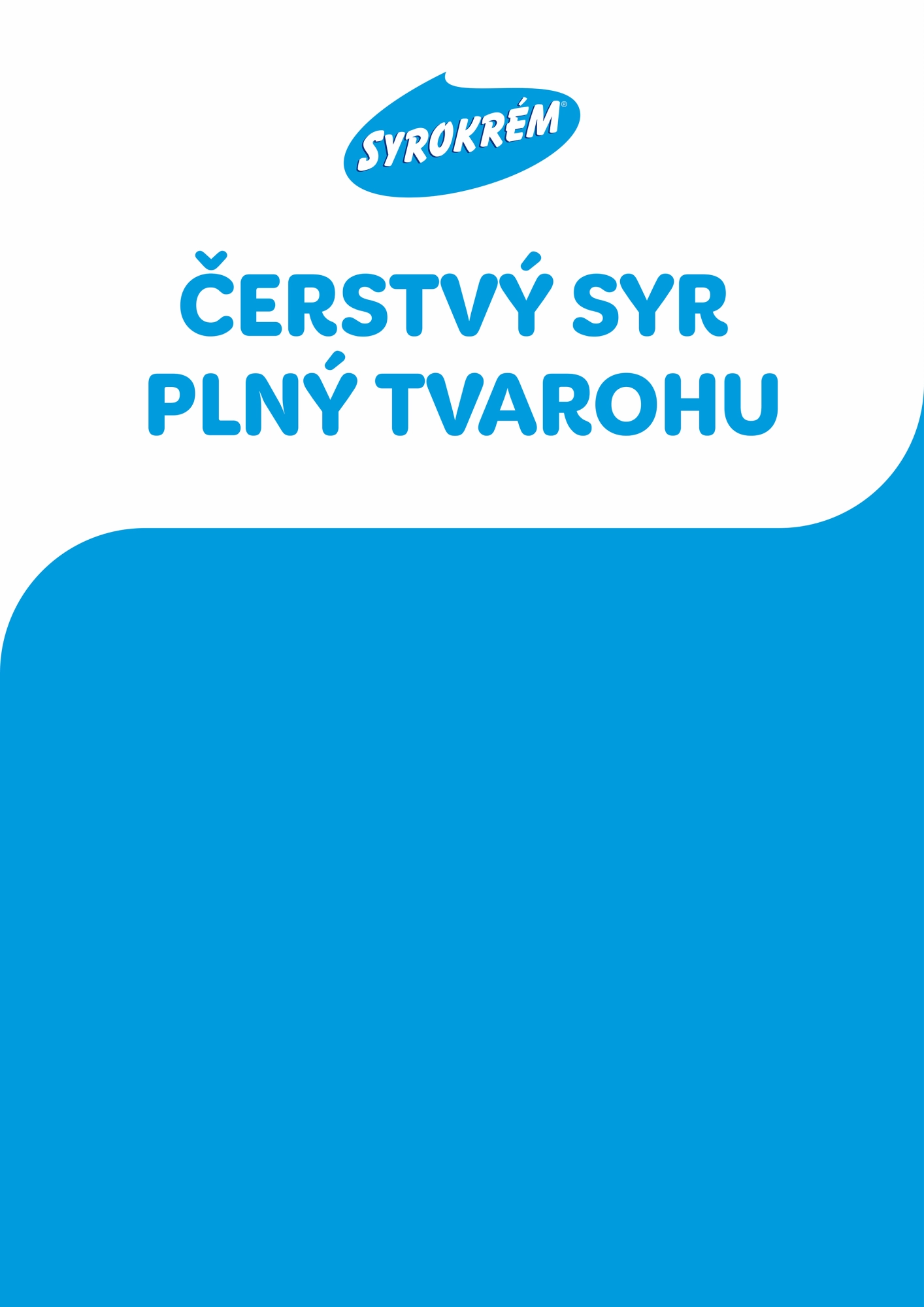
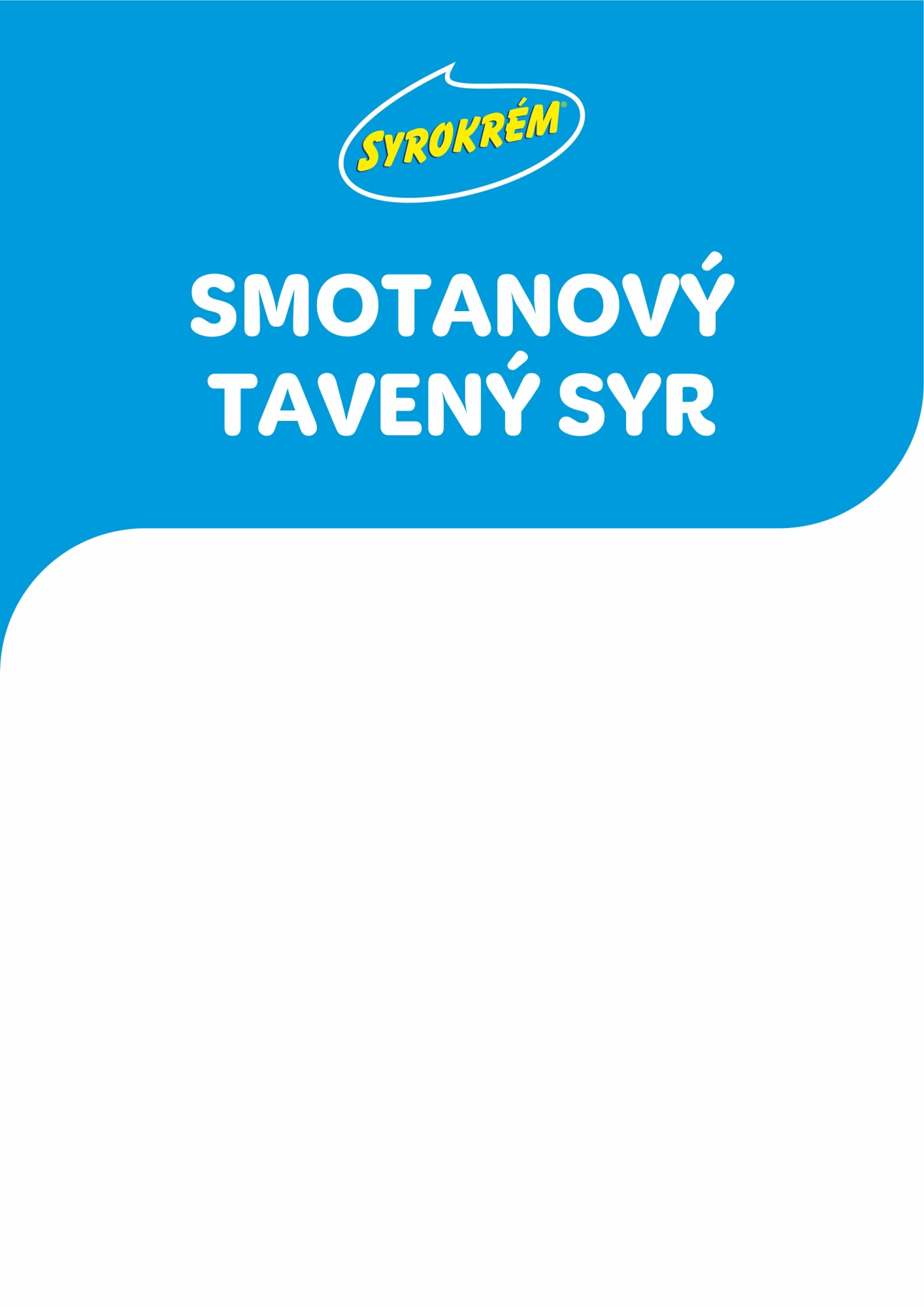
Blue is used as a background for the logo and text. White under the picture.
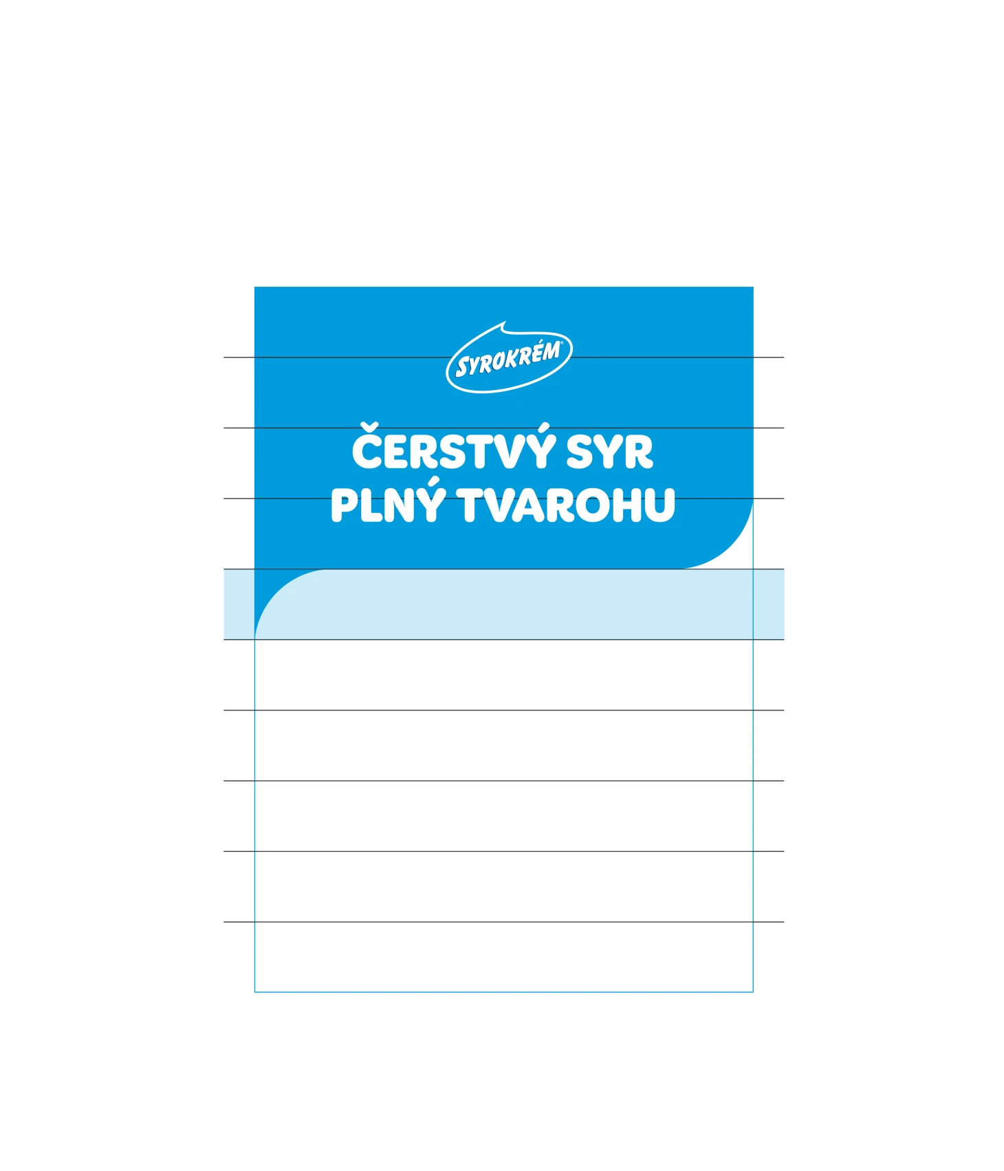
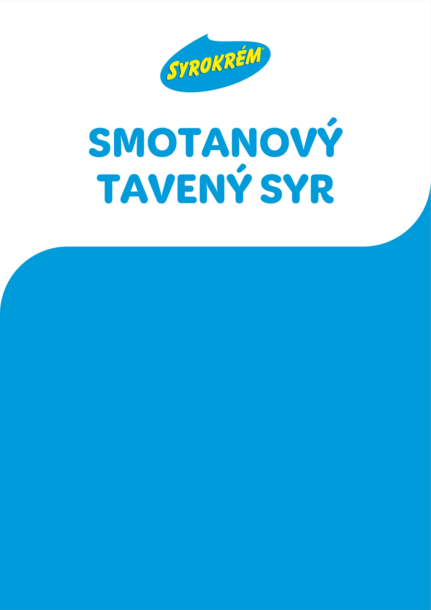
The logo and text are always centered in the wave.
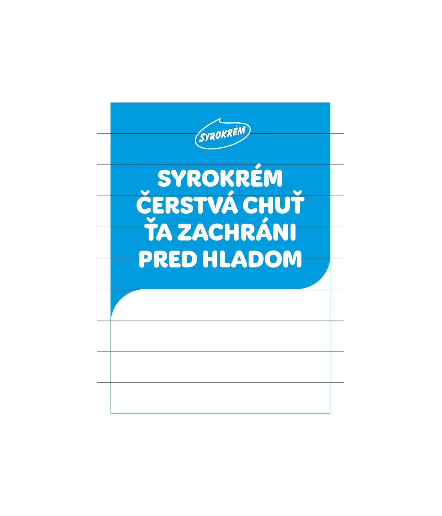
The size of the logo is 1/10 of the height of the visual.
The size of the wave is 1/10 of the height of the visual.
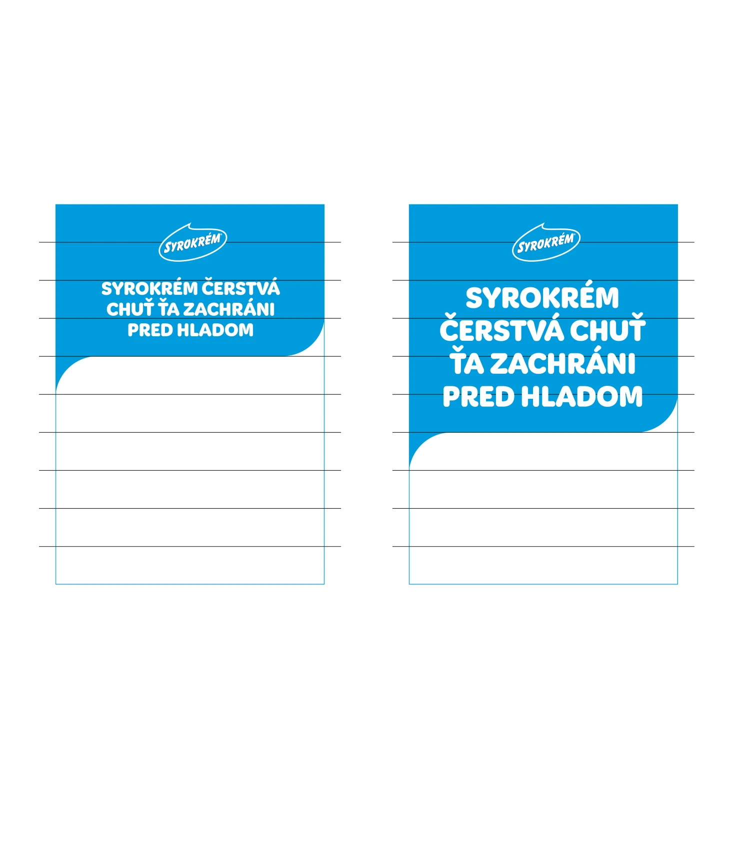
The height of the wave can be adjusted to the length of the text, but it always moves by 1/10 of the height of the visual.
The alignment of the text in the wave is always centered. The size of the text depends on its length. It is important that the gap between the logo and the text and between the text and the edge of the wave is optically the same.
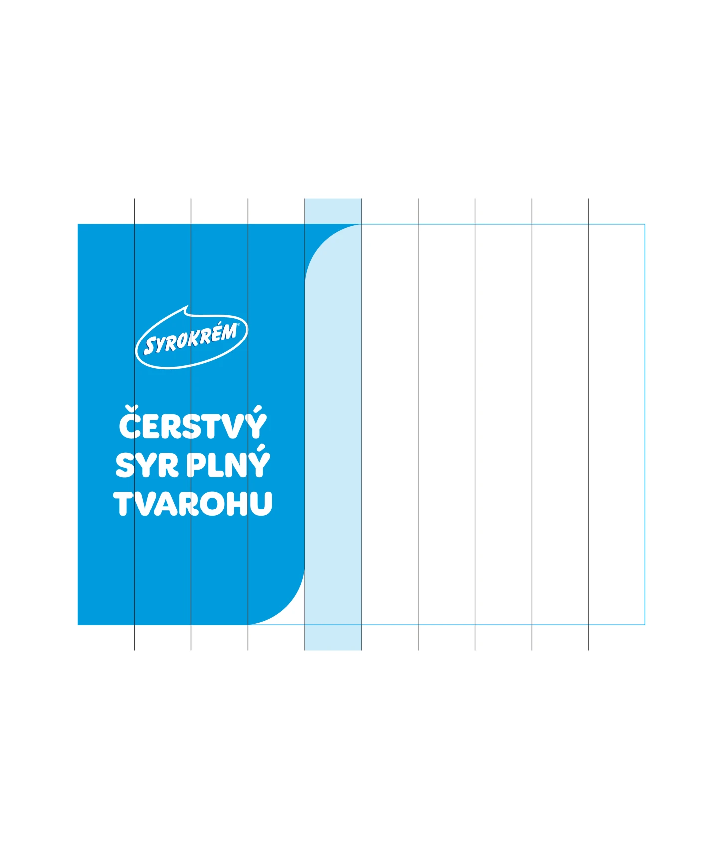
The ratio of wave to image is individual and is up to the creator to decide based on whether text or image is more important.
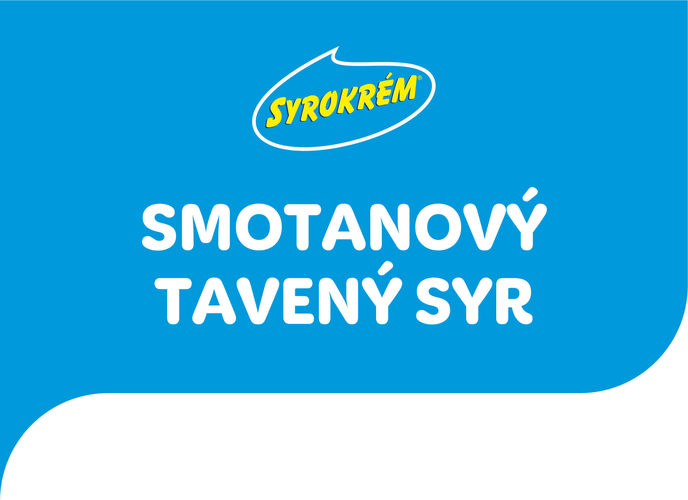
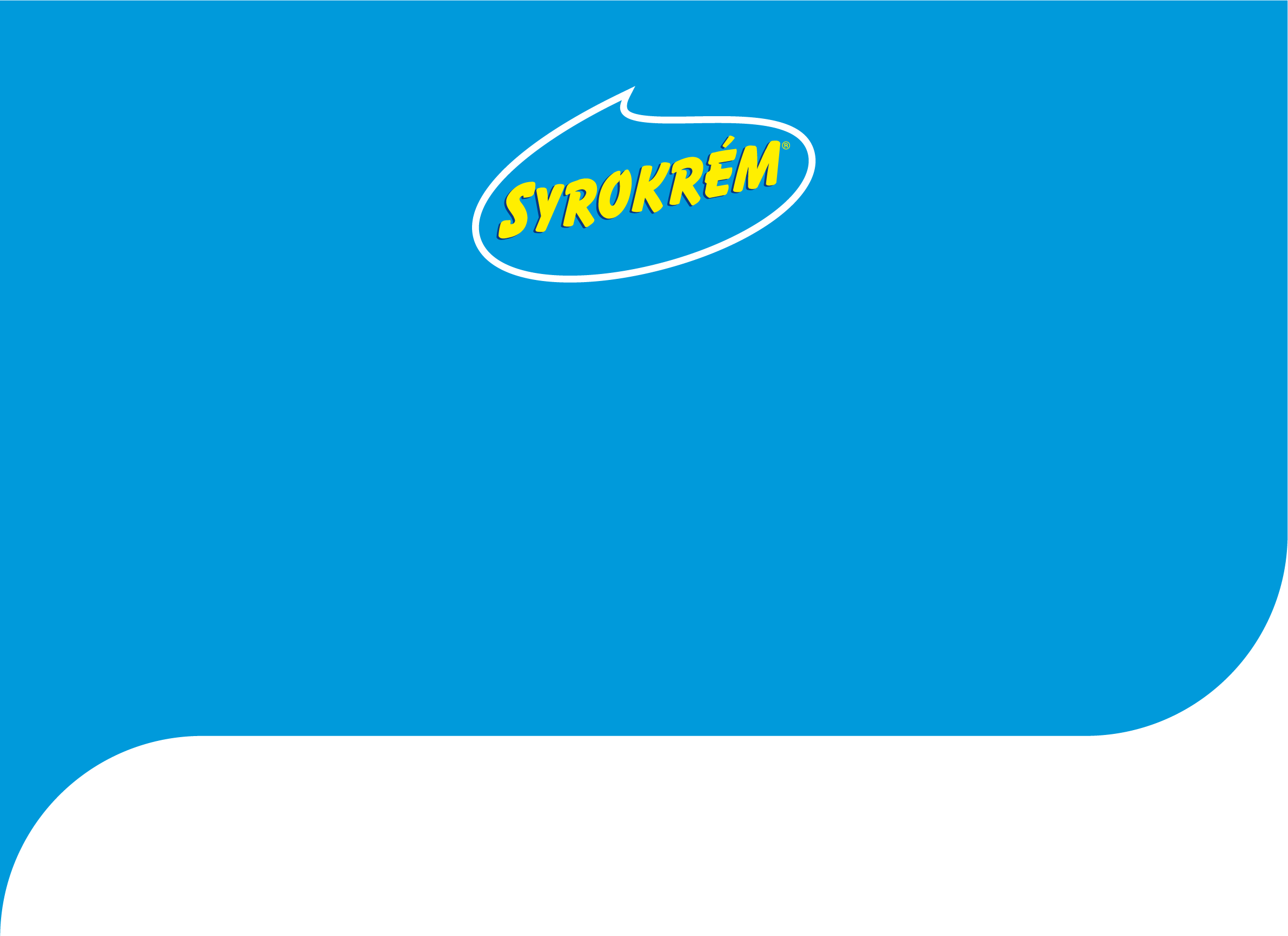
THE SAME RULES APPLY TO LANDSCAPE FORMATS
The logo size is 2/10 of the width of the visual.
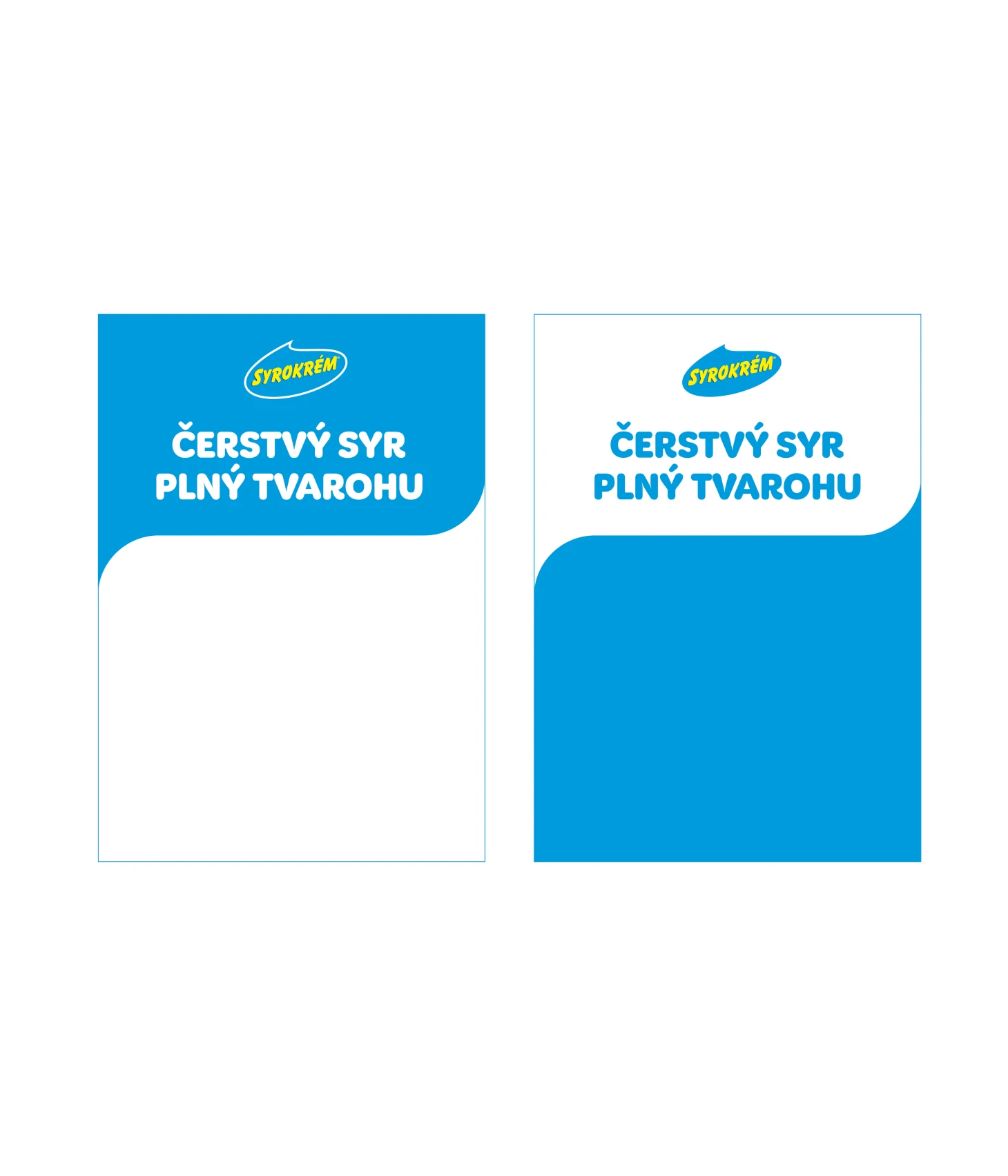
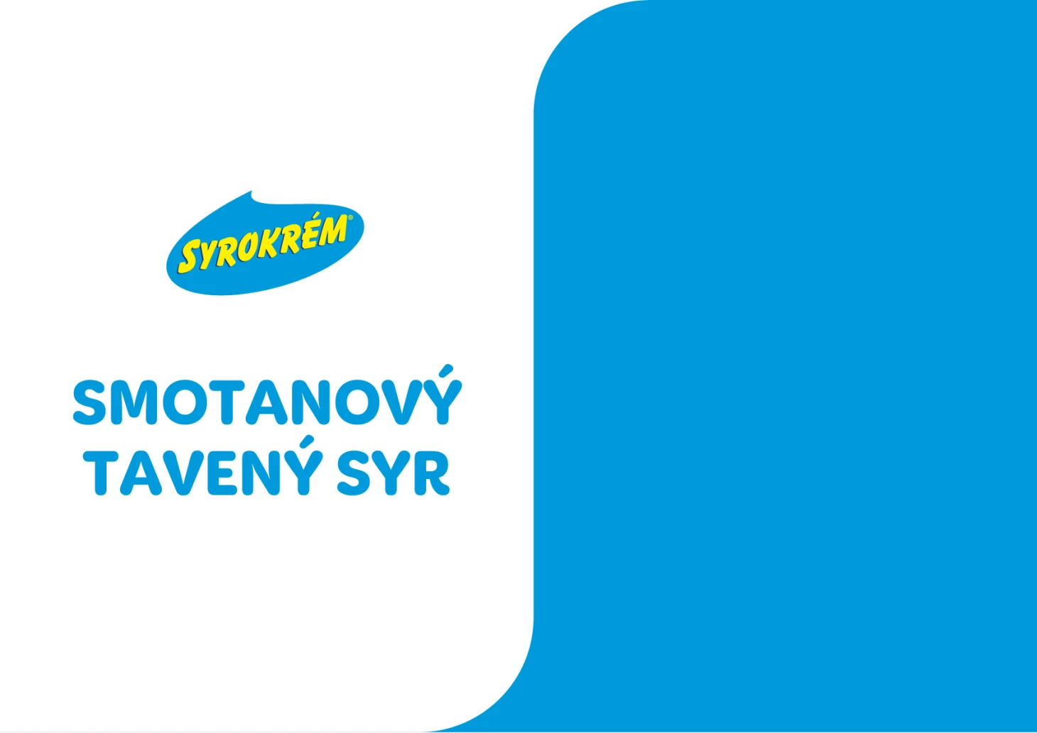
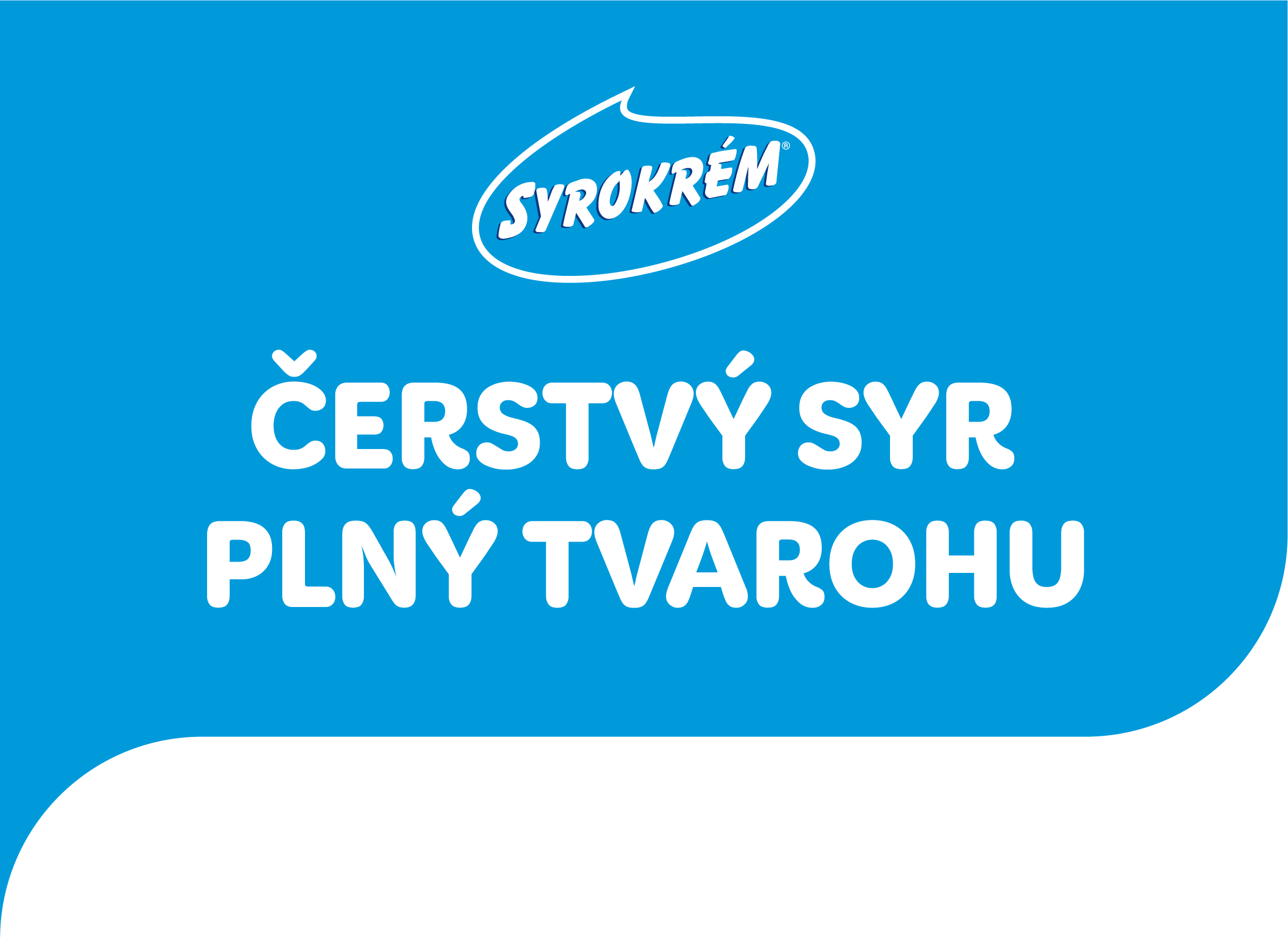
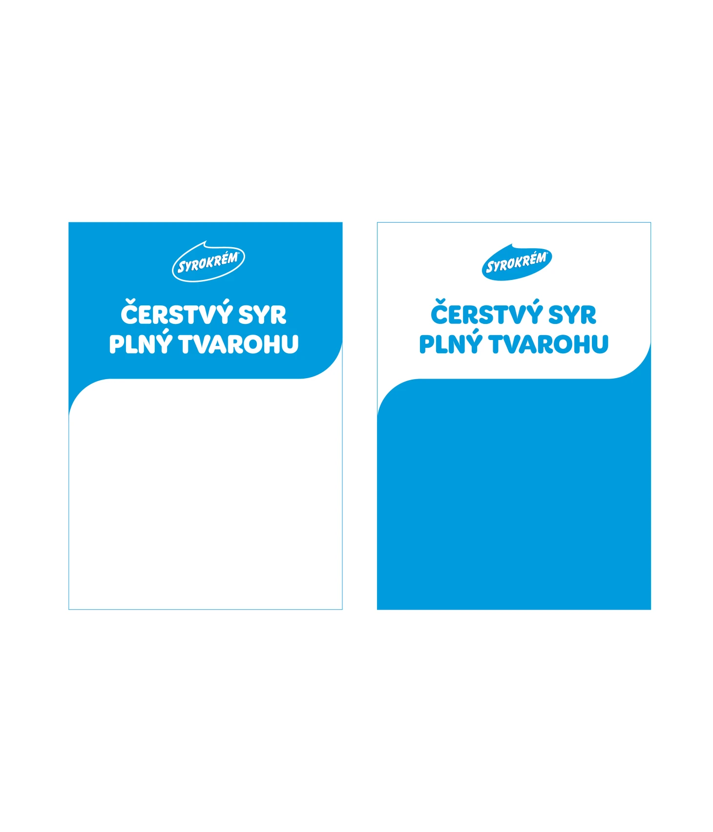
WE USE TWO TYPES OF WAVES
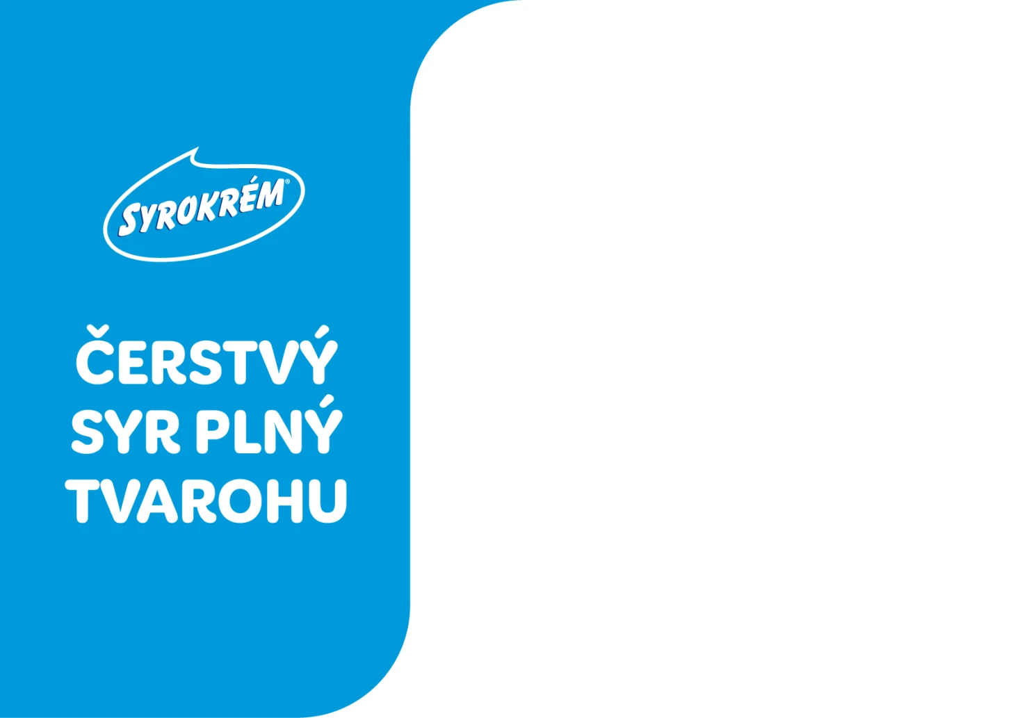
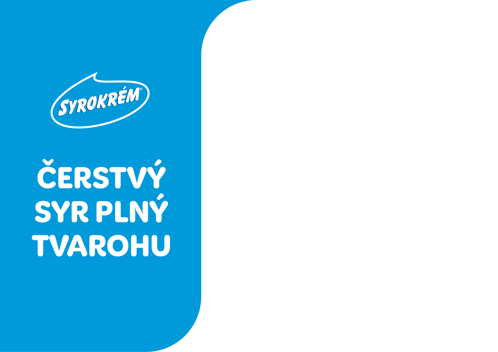
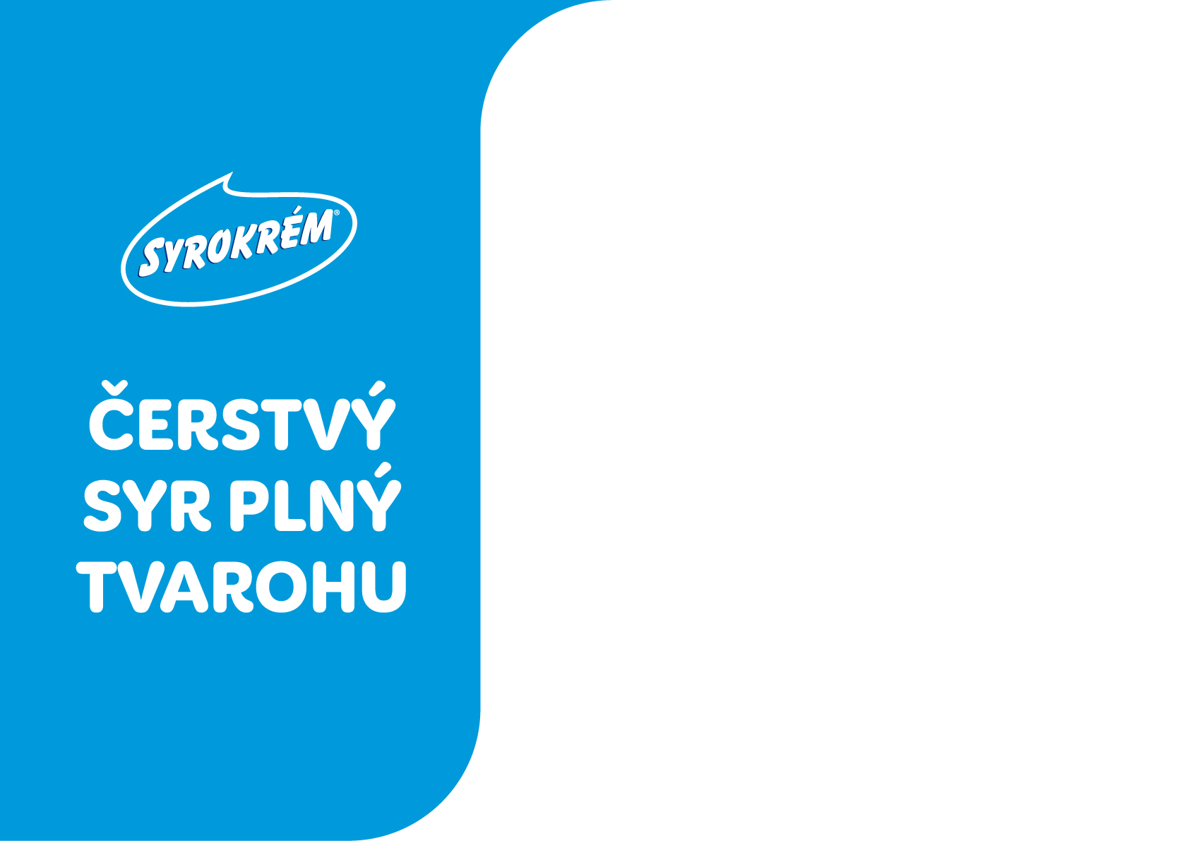
Blue wave, white text
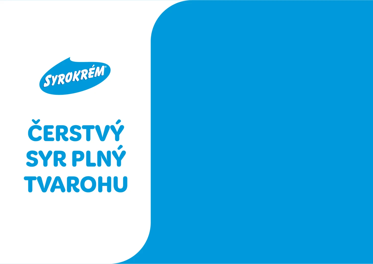
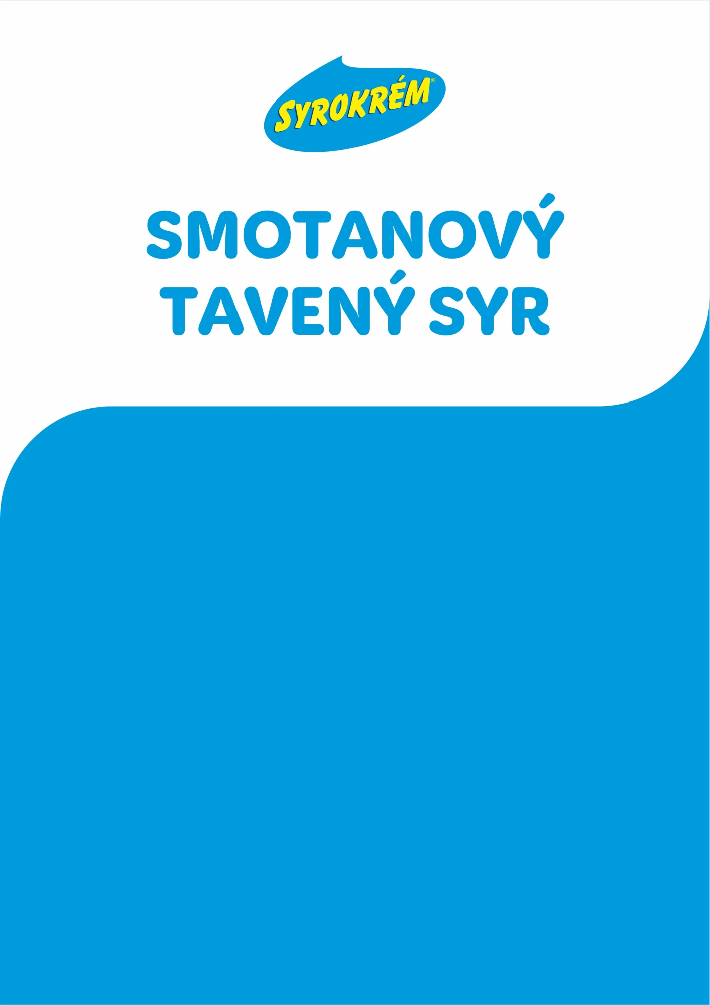
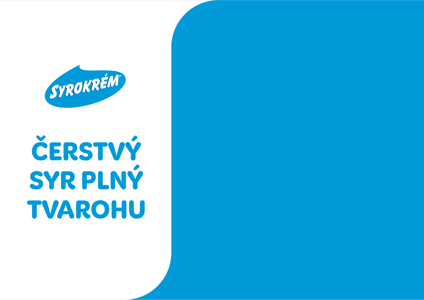
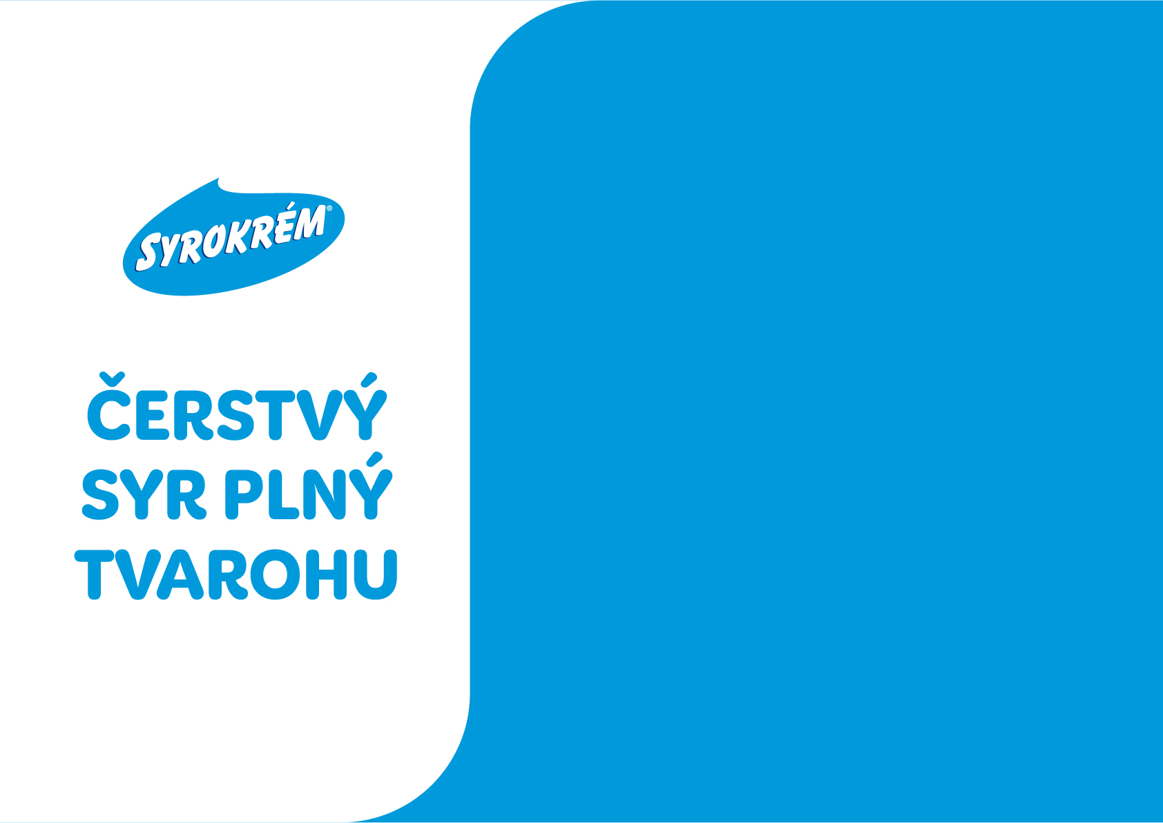
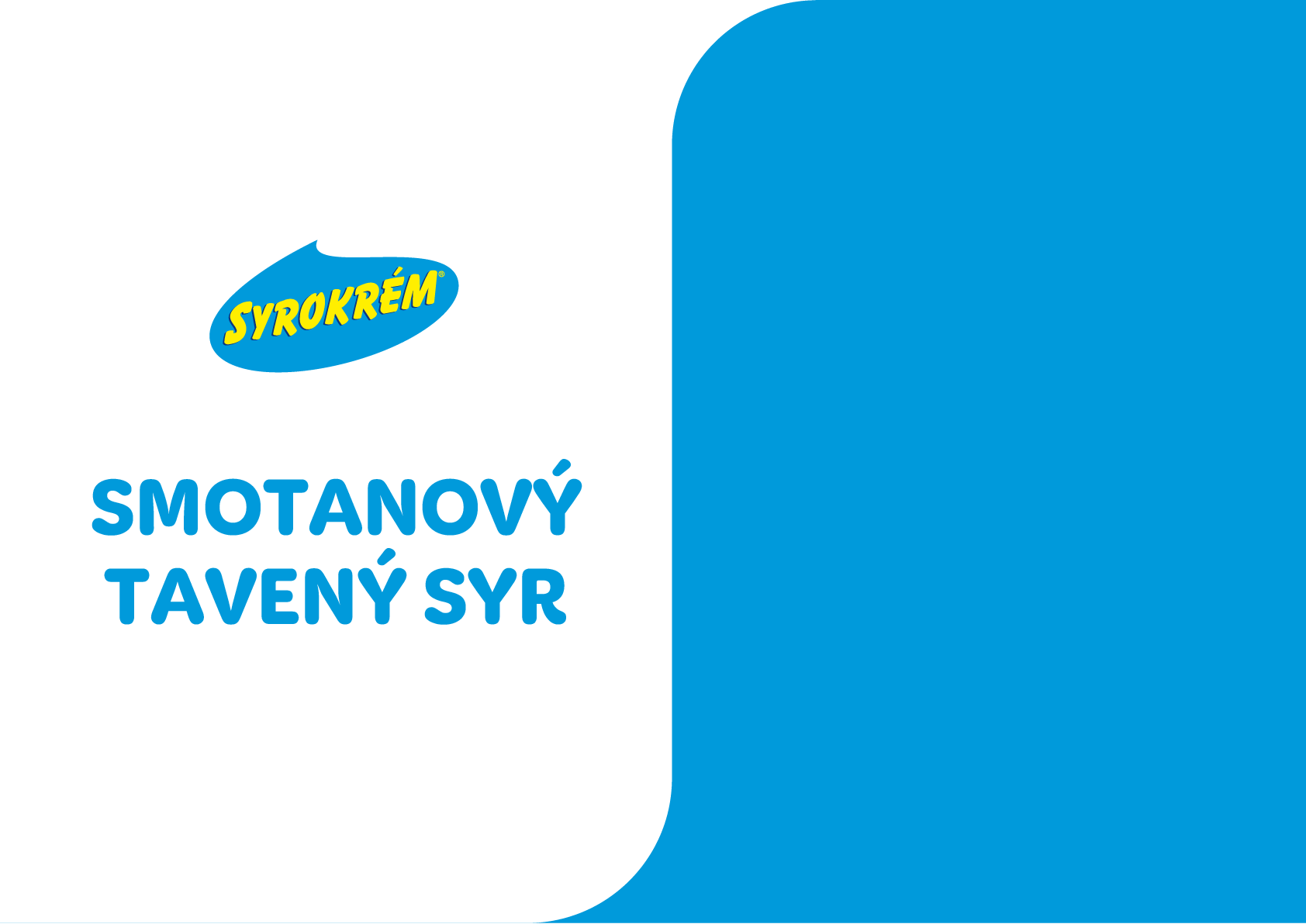
White wave, blue text
EXAMPLE
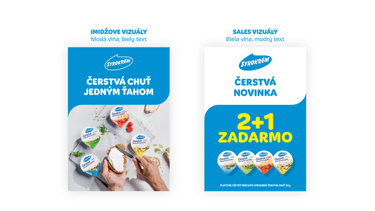
SYROKREM TEMPLATE „A“
ČERSTVÉ TVAROHOVÉ SYRY
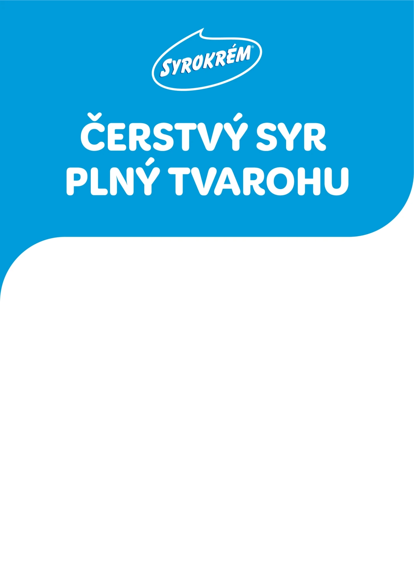


syrokrem template logo

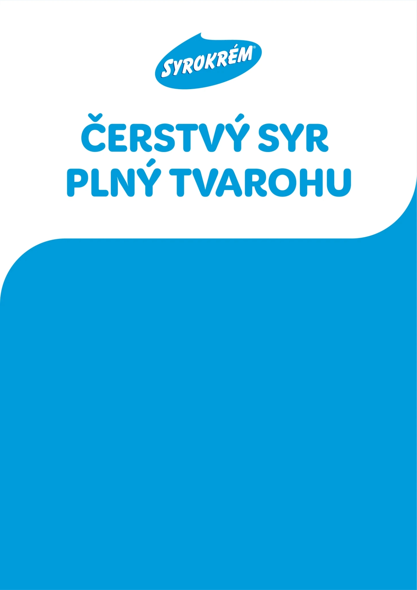

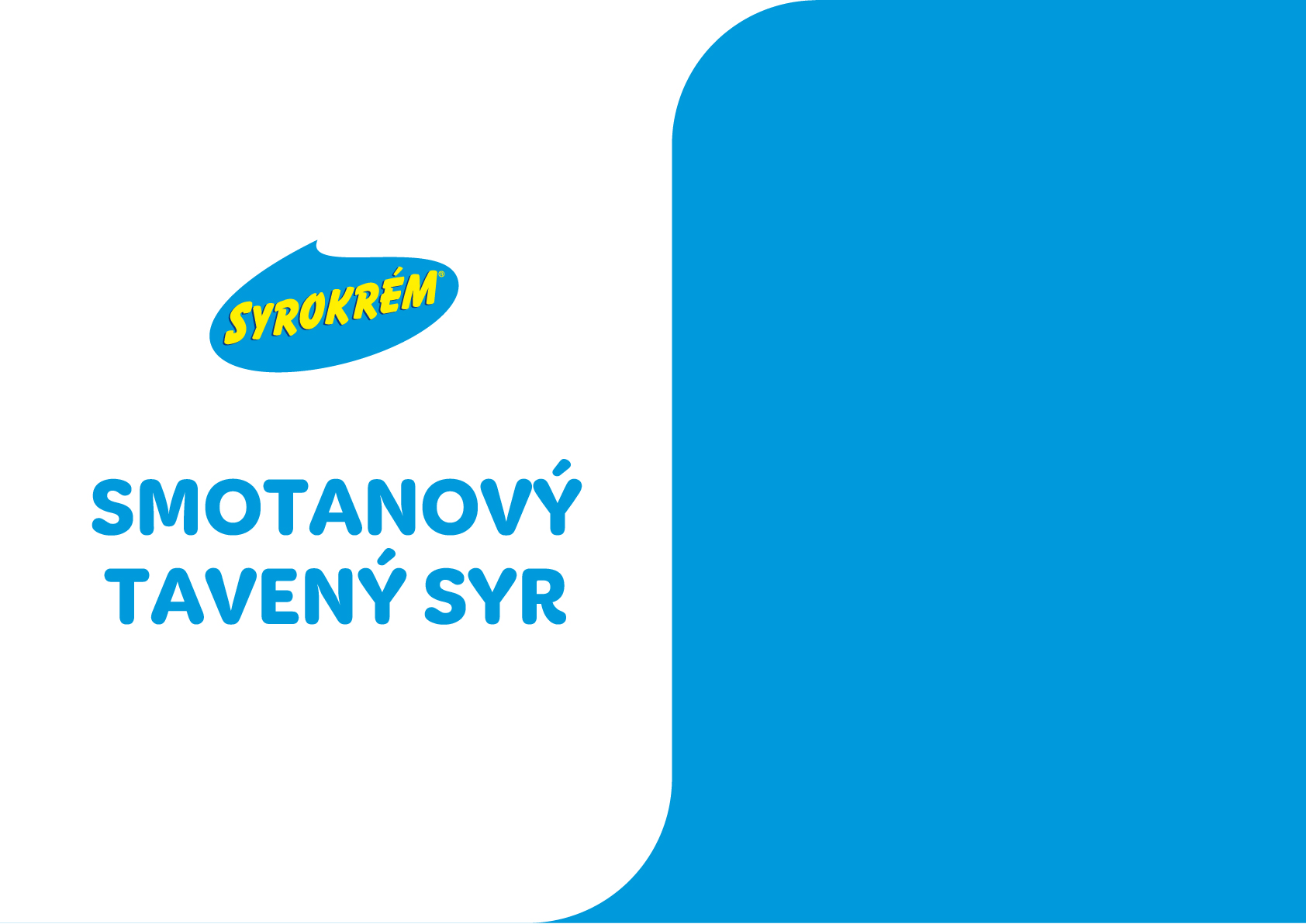
syrokrem template logo and claim
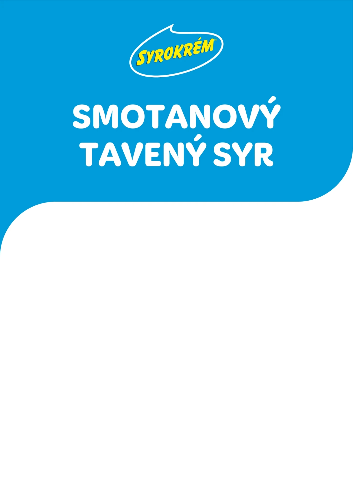


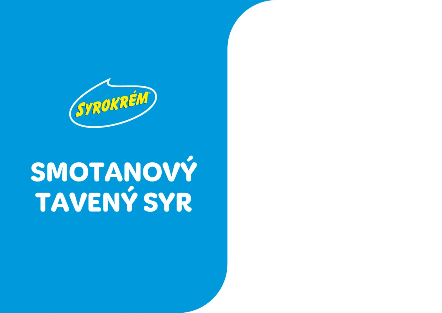
SYROKREM TEMPLATE „B“ PROCESSED CHEESES
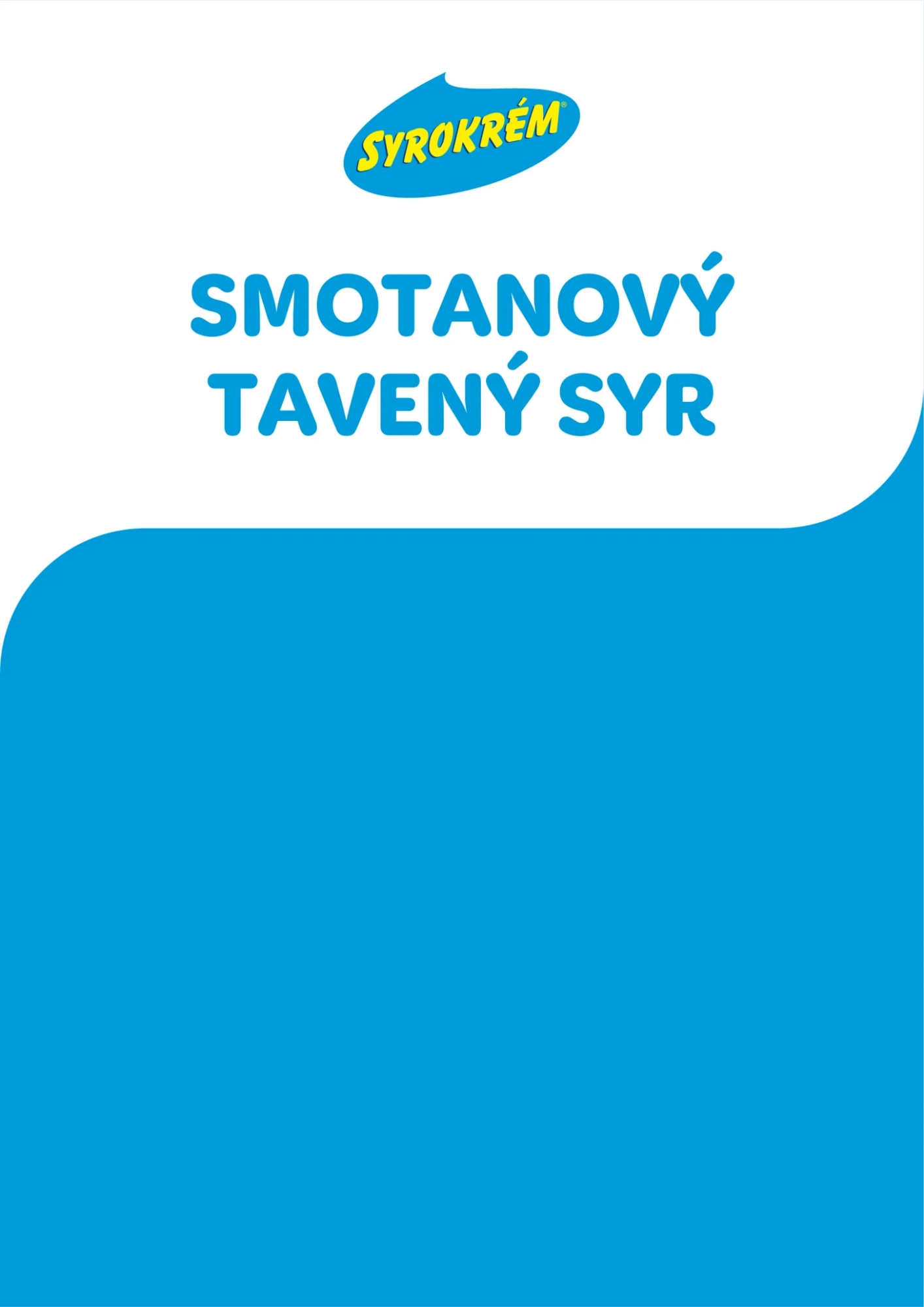

SYROKREM TEMPLATE „A“ Landscape version
ČERSTVÉ TVAROHOVÉ SÝRY